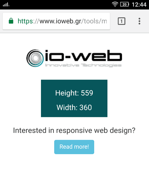
A tool that allows you to view your screen dimensions.
In web development, and more specifically when doing responsive design, it is useful to know the actual screen size of a device as it would appear for a CSS media query. For this reason, we developed a simple tool that does exactly that. It will show you the width and height of the screen of the device you are using.
Its main features are:
Simplicity: It shows only the useful information
Responsive to screen orientation changes, without needing to reload the page
CSS only: It provides the same results as a CSS media query would
But why would you need to use this tool?
When a web designer creates a responsive website, it must be compatible with a wide range of mobile and portable devices that may have different effective screen widths (the manufacturer’s resolution is not the actual screen width; otherwise, a Full HD phone would display the desktop version of a website). Therefore, knowing the screen size can greatly speed up debugging and help ensure you don’t break working screen dimensions.
Keep in mind that scroll bars, toolbars, and other user interface elements can also affect the screen size.
When you visit any web site, it may store or retrieve information on your browser, mostly in the form of cookies. Control your personal Cookie Services here.